by Lee Wayland | Apr 6, 2016
GG’S HEALTH AND FITNESS The proprietor of GG’s Health and Fitness approached Lee Waylandupon referral from an existing client. We were required to turn a concept provided by the client and turn it into a multi-media logo version to be used online and for print. We...
by Lee Wayland | Apr 6, 2016
ACHIEVE KEY SOLUTIONS As a new start up company, Achieve Key Solutions required a fresh, inspiring logo to promote exactly what the company offers. Help so you can achieve your goals. MORE LOGOS WARN AND CO Business/Financial, Logos H&M PLANNING Building, Logos...
by Lee Wayland | Apr 6, 2016
LIBERTY LODGE SUPPORTED LIVING Liberty Lodge came to us in 2012 for a new logo. They wanted a theme of support and embrace. The initial concept they asked for was an image of a lodge with hands underneath it. However, it was soon apparent this was too literal. We...
by Lee Wayland | Apr 6, 2016
SOLAR HOMES WORK As a new business looking to stand out in a new and competitive market place, Solar Homes Works required a simple, effective logo to symbolise Solar Energy. Ian was very focused on the end result required, so from his sketches and concept, Lee...
by Lee Wayland | Apr 6, 2016
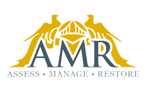
AMR AMR required a logo design that reflected the high net worth clients they interact with on a daily basis. The logo is a reworking of a family crest, two birds either side of a knights helmet, tweaked to look like a mansion, with gardens and trees. When printed,...


Recent Comments